In outdoor advertising, the design decides within seconds whether a message lands. People drive past, wait briefly at the lights or glance out of the tram. They have no time to read and no reason to make an effort. Good creative makes it easy for them.
Here are the key design rules for large-format outdoor advertising such as scaffolding and facade banners.
1. One message, not three
The most important rule: focus on a single statement. What should someone take away from a quick glance at the surface? Anything that does not support that statement does not belong on the banner.
A well-known industry rule of thumb is to use as few words as possible, ideally no more than a handful. The greater the distance and the faster the traffic, the shorter the text needs to be.
2. Contrast before aesthetics
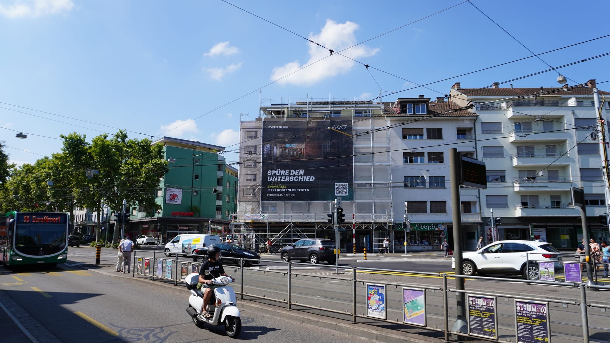
A design that looks elegant on screen can disappear on the street. Make sure there is strong contrast between text and background. Light text on a dark background, or the other way round, is almost always more legible than tone-on-tone. Consider the surroundings too: a facade, trees or the sky behind the banner all affect how it reads.
3. Typography for distance
- Bold, clear typefaces are easier to read than thin or decorative ones.
- Large type sizes: what looks big in the draft is often small from fifty metres away.
- Few lines: one or two lines are ideal.
- No blocks of capitals: longer text in capitals is harder to read.
4. One strong image
A single, expressive image works better than a collage. People, faces and products in close-up draw the eye. Make sure the image still makes sense when heavily reduced, because that is how the audience sees it from a distance.
5. Make the logo bigger than you think
If people remember only one thing, it should be your brand. Place the logo where it is clearly visible and large enough to be recognised from afar. On very large formats it pays to keep the logo and the key message close together.
6. Choose colours carefully
Colours carry mood and brand identity. In the cityscape your banner competes with many other impressions. Strong, clear colours that fit your brand stand out better than pastels. Keep in mind that mesh material makes colours look slightly lighter.
7. Think about the site
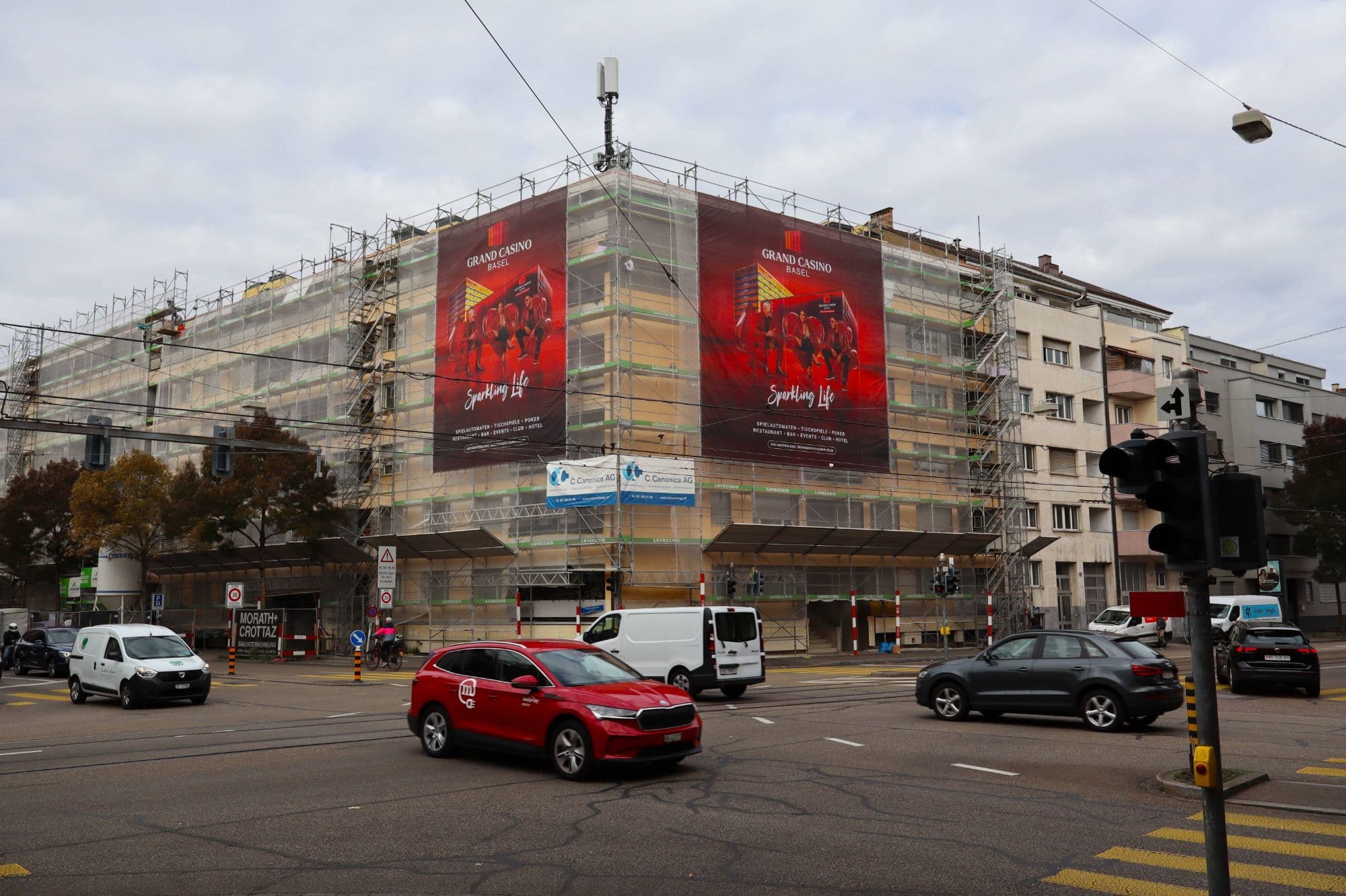
Every surface is seen differently. A banner on a corner building is visible from two directions; a site on an arterial road is often seen at an angle from a moving car. Before designing, ask how your audience sees the surface. In the campaign by Grand Casino Basel at Riehenring 141, two banners cover both street faces so the visual works from every direction of travel.
8. Speak locally
A reference to the city or neighbourhood creates closeness. It can be a place name, a pointer to the nearest store or a visual that connects to the surroundings. In Basel, where commuters from France and Germany are also on the move, it pays to keep the message as visual as possible.
9. Test before printing
Test your design before it goes to print:
- The phone test: look at the draft small on your phone. If it is not legible there, it will not be legible on the street.
- The three-second test: show the draft to someone for three seconds. Can they say who the ad is from and what it is about?
- The distance test: print the draft small and look at it from a few metres away.
We explain the technical requirements for artwork in Scaffolding banners: print files, specifications and design.
FAQ
How much text belongs on a scaffolding banner?
As little as possible. A short key message, the logo and perhaps a short web address are enough. Anything more distracts.
Can I use an existing poster design?
Often yes, but it needs to be adapted to the format. Large-format banners have different proportions, and small details get lost at a distance.
Does Hyde Media design the visual?
Hyde Media handles print, installation, removal and permits. We are happy to advise on how your visual will work on a given site.
Have a visual and looking for the right surface? Contact us.